

GoodEarth was initiated by a group of engineers and architects in the late 80s, inspired by the explorations in alternative architecture by Laurie Baker on sustainable and decentralized development, sensitive to the environment and people.
They are a multidisciplinary organization whose ethos stems from holistic design by putting nature in the centre. Through their residential communities, regenerative agriculture and ecological restoration projects, they address larger environmental and social challenges that require time, innovation and common sense.


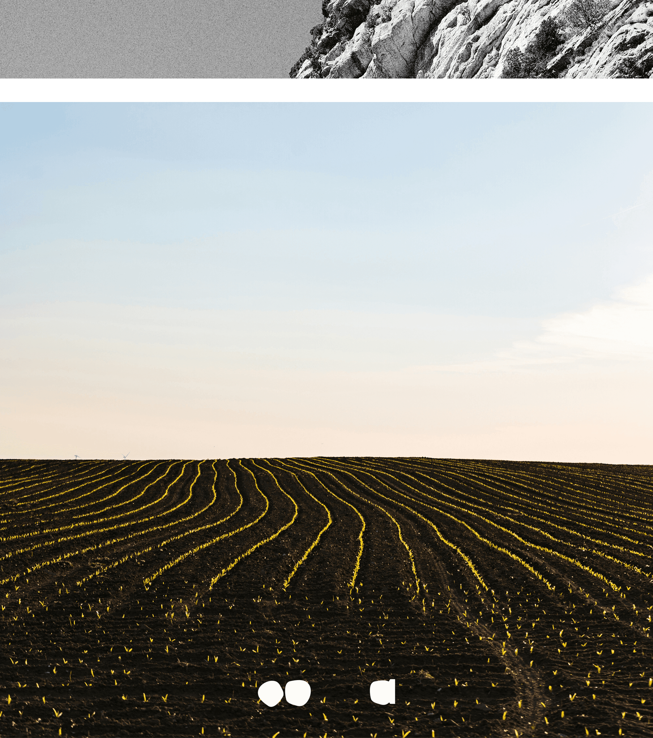
Soil is the
Protagonist
But today, as we face an increasingly likely future of scorching summers, melting glaciers, and worsening storm systems, researchers and climate experts have begun taking geoengineering—and more specifically its SRM subset—more seriously. Many now see a real, growing need for eventual solar-modifying climate solutions.


Besides the color palette, we wanted to use gradients as organically as possible and be open to variations and asymmetry. These are some simple examples for what we will be using with the intention of gradients being an endless exploration and evolution with how the organization moves forward.


Structurally, GoodEarth has three areas of operations. To indicate this within the website, the shapes within the logo were rearranged and modified to their respective nature of work.


The concept for layouts involving excerpts, paragraph(s) or any considerable text, was to have some form of interaction between all the ingredients. Using Union by Radim Peško, an extremely simple font, we were able to make the text element ‘adapt’ to shapes inside the background image, which we wanted to be at the center of attention. Further, other smaller elements were also placed where they seemed to ‘fit’ instead of following a grid based layout. This was a much more organic approach to how GoodEarth can be expressed.


Explorations that might’ve worked if the company was starting today, what GoodEarth needed was a much more accommodating and stable identity.





Scanning and documenting to emphasize small\peculiar items within the brand was essential. They carried a lot of the narrative that was being presented.
These rock textured buttons were a successful attempt to imitate nature through technology which in this case was 3D Printing. As a lot of testing and failed attempts are involved in making something like this, a documentarian approach made logical as well as narrative sense.
Rusted Wooden Buttons for example, are unique and beautiful, to effectively show their intricacies and how the rust infects it, the best way would be to just zoom in.

Another way to mimic nature was to develop 3D printed shoes, Anarok and Reptalons. These are their cross sections.
Anaroks were SLA-printed-rock-textured shoes and the Reptalons were algorithmically designed barefoot shoes that resemble the feet of a reptile. Both were fascinating to look at. What was even more fascinating was how they were constructed(printed) from within, this gave us the opportunity to showcase the project through these ‘x-rays’, this was done with multiple types of papers and films layered and then scanned.


Some assets that were a part of the invite for the Paris Showroom that happened in June/July 2026.

Our storytelling mainly revolved around layering scanned prints of images with digitally developed assets that mimic transparency in some sense. Like a lot of other things within the brand, we mimicked natural patina and textures where necessary to in turn highlight the intricacies of what we were trying to imitate. The second part was the documentarian style approach to emphasize on these ideas.


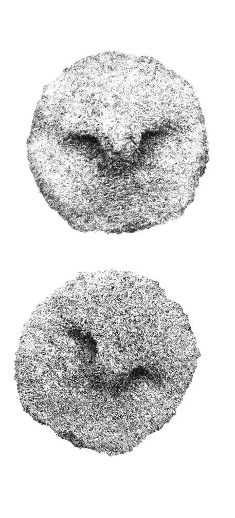
Yak Wool, 2 x 2.5 inches
To understand the depth of its craft and emphasize every aspect of the fabric, high fidelity scans were a part of its storytelling. The scans also carry the theme of having a documentarian and academic approach to the brands work.
These fabrics were made out of necessity by communities across India with whatever nature had to offer. They serve a fundamental purpose in their lives. Yak Wool for example, was used to make nomadic tents in the Tibetan Plateau. It was key for the people there to survive. We used pencil drawings as part of our storytelling on social media to talk about how the fabric came to be in the first place.

Eggs made from images of Anaroks and Reptalons. This is nothing more than self-indulgence.